Always Cook on the Bright Side

A few weeks ago I was contacted by Mia, the head chef at Always cook on the Bright Side to create an illustration that captured what her company is all about and showcased her personality through some favourite ingredients, typical utensils and standard messiness!

Always Cook on the Bright Side

The image above however, it not quite the end result… Mia wanted the illustration to be printed on to T-shirts. Which are now available for pre-order now until 13th December! ORDER HERE

Screenshot 2020-12-01 at 16.25.50.PNG

By purchasing a tee not only are you supporting two small business, but also £2 from every sale will go to Refugee Community Kitchen, who serve hot nourishing meals to displaced people across the UK and France. 🥘 so if you are able to, buy something worthwhile this Christmas!

The t-shirts printed by Everpress are Fair-wear, Climate neutral and Global Organic Standard accredited 🌎 The Earth positive T-shirt runs from an XS-XXL 👕

Happy Hamper Co.

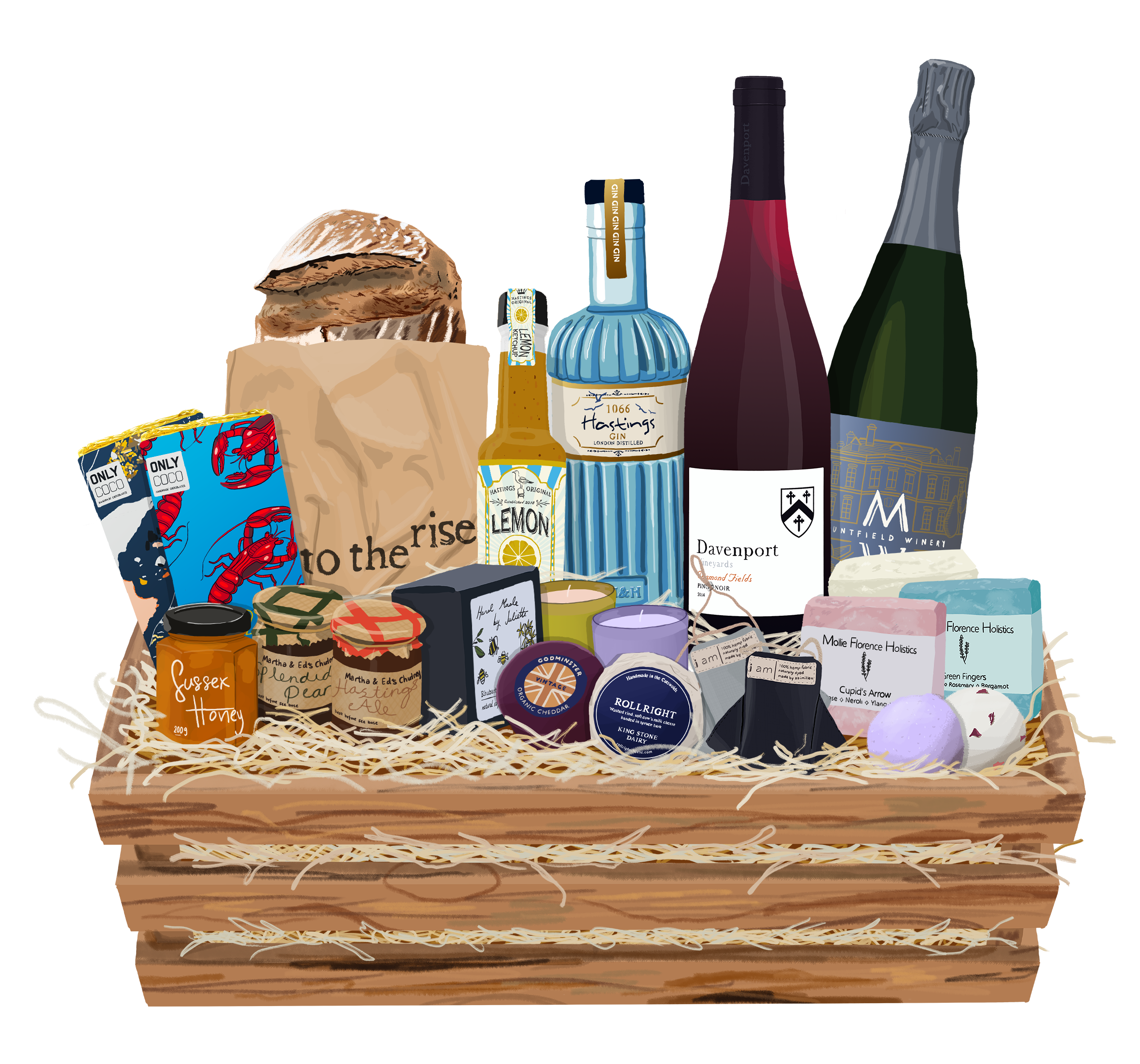
Over the last few weeks I’ve been working closely with the team at Happy Hamper Co. to create some marketing illustrations for their latest campaign.

Full Hamper.png

Happy Hamper Co. is a curation of local products, gifts and eateries across the whole of East Sussex. They’ve dedicated the Christmas period to an online raffle to support a local cause, Care Leavers Christmas, which will provide gifts to Care Leavers across East Sussex, Brighton and Hove so please follow and support if you are able to this year ❤️https://happyhamper.co/

I drew a selection of their favourite locally sourced products in partnership with some local suppliers to feature inside their classic hamper! See below for a list of featured businesses:

Tonal Tropics

I set myself a challenge to create a collection that’s a little different, something to expand my practice and portfolio whilst also boosting attention on my online shop. The challenge, was to work within limited colour pallets and create immersive scenes, as I often find myself falling back into the habit of drawing easier and more straight-forward perspectives that are resultantly far less engaging for my audience. I’m happy to say the end result was worth the challenge!

Having worked in house creating marketing content for the last few months, it was really nice to really focus on a personal project that didn’t have a marketing or editorial context it had to abide to! Not of course that they don’t serve an illustrative purpose, just more decorative! This was also proved by the attention they have received on Instagram and through the first day of sales on my shop!

I made the decision to close my shop in January as my Squarespace subscription will renew, and I’d like to focus and steer my work more in the direction of marketing and editorial, however I wanted to go out with a bang and feel a little success from this side venture, which I definitely have!

Due to lockdown, I had to think about my shop a little differently and plan ahead, I ordered the stock from Awesome Merchandise and I’m incredibly happy with the vibrancy of the colours and amazing quality. I was also able to get them printed on recycled card stock so it’s smiles all round.

The stock is however limited and a few options are already running super low in stock so grab them whilst you can, ideal for Christmas presents too, shop now.

Lockdown 2

With the new Lockdown starting at the beginning of this month and being placed on furlough from my in-house illustrator role, it’s brought my mind back to the same typical question of how can I keep busy, happy, productive etc. Furlough was unexpected since I already work from home, so it’s strange acknowledging I now have all this additional time to work on personal projects, something I’ve wanted for ages, yet now it’s here I’m lost with what to do.

I reminded myself of the projects I took on last lockdown, and how they made me feel. One of the most successful and enjoyable was ‘Locked In’ . My aim was to put a positive spin on a pretty miserable situation by creating drawings that focus on what we have rather than what we don’t. I decided to draw rooms in people’s homes, capturing each and every object and detail that painted a picture of the people that lived that.

I used reference photos sent to me as obviously I wasn't able to visit, and the purpose of the collection was to capture their personalities but without people, by including all the personal details found within their homes and using this alongside colour and cropping to suggest their character. I wanted to help people appreciate the beauty of their homes; despite the fact we were locked which was pretty isolating at times, we were locked in some amazing spaces that hold so many important memories.

The first home I drew belonged to my oldest friend Ella, and her lovely housemate Sophia. The two were separated for lockdown as they both went home to their parents. So the drawing was a gift to remind them of each other and their favourite place in the home. I had visited their home a few months earlier and was welcomed so warmly by them both and inspired by the surroundings. I think someones home says a lot about them.

ellas house small.png

The second home I drew belongs to my dad and step-mum. They are obviously older than my usual acquaintances and therefore it’s expected that their home may be of a different general aesthetic. I feel this history is captured in all the small trinkets, suggesting their personalities, travels and key moments in their life.

dad and hujs house smol.png

For my next drawing, I wanted to think outside the box and challenge myself to not only a home I had never personally visited but also belonging to someone I didn’t know. So, I sent out a request to my Instagram followers, to send in reference photos, for me to choose from to create my next illustration within the collection. The photo I happened to choose was from a complete stranger, and also international! I felt so special to gain this insight into a strangers life, seeing the place in which they spend 90% of their time.

competition winner.png

The final illustration to the series (for now) was done of my best friend’s home. Unlike all the others that capture a shared space, this belonged to one person. Elsie had moved 4 times in the space of a year, and this image captures everything in the world that is hers. Knowing her personally, I knew and felt the importance of this.

Elsies room part 2 smaller.png

The image is also super sentimental to myself, as I had drawn her old room a year earlier, at a time were I was still establishing my illustrative style. Seeing the growth in the drawing quality and also the improvement in Elsie’s mental health from a year apart has been super motivational.

Elsie's Room.png

Reflecting over this collection has made me want to continue it. During Lockdown 1, I was living elsewhere in a pretty uninspiring house. Despite moving to Bristol in July, to an absolute dream flat, it’s still pretty visually dull, so I doubt my own home will make a feature. Don’t get me wrong, I absolutely love my home but I’ve ironically found I like my space clear and clean and my drawings super busy with a million things going on. This may mean a second call out for reference photos may be in order…